Tracing Environmental Narratives A Web-based Tool
🔍 Why Your Daily Commute Tells a Story
Have you ever thought about how your daily travels—whether it’s your walk to work, a drive to the grocery store, or a bike ride through the park—could reveal deeper insights about your environment and how you feel about it? We certainly did! In our latest research, we developed a web-based tool that combines GPS data with personal narratives to create a vivid, interactive map of how people experience their surroundings. This isn’t just about tracking where you go—it’s about understanding how you feel along the way.
🛠️ How We Did It: From GPS Tracks to Emotional Maps
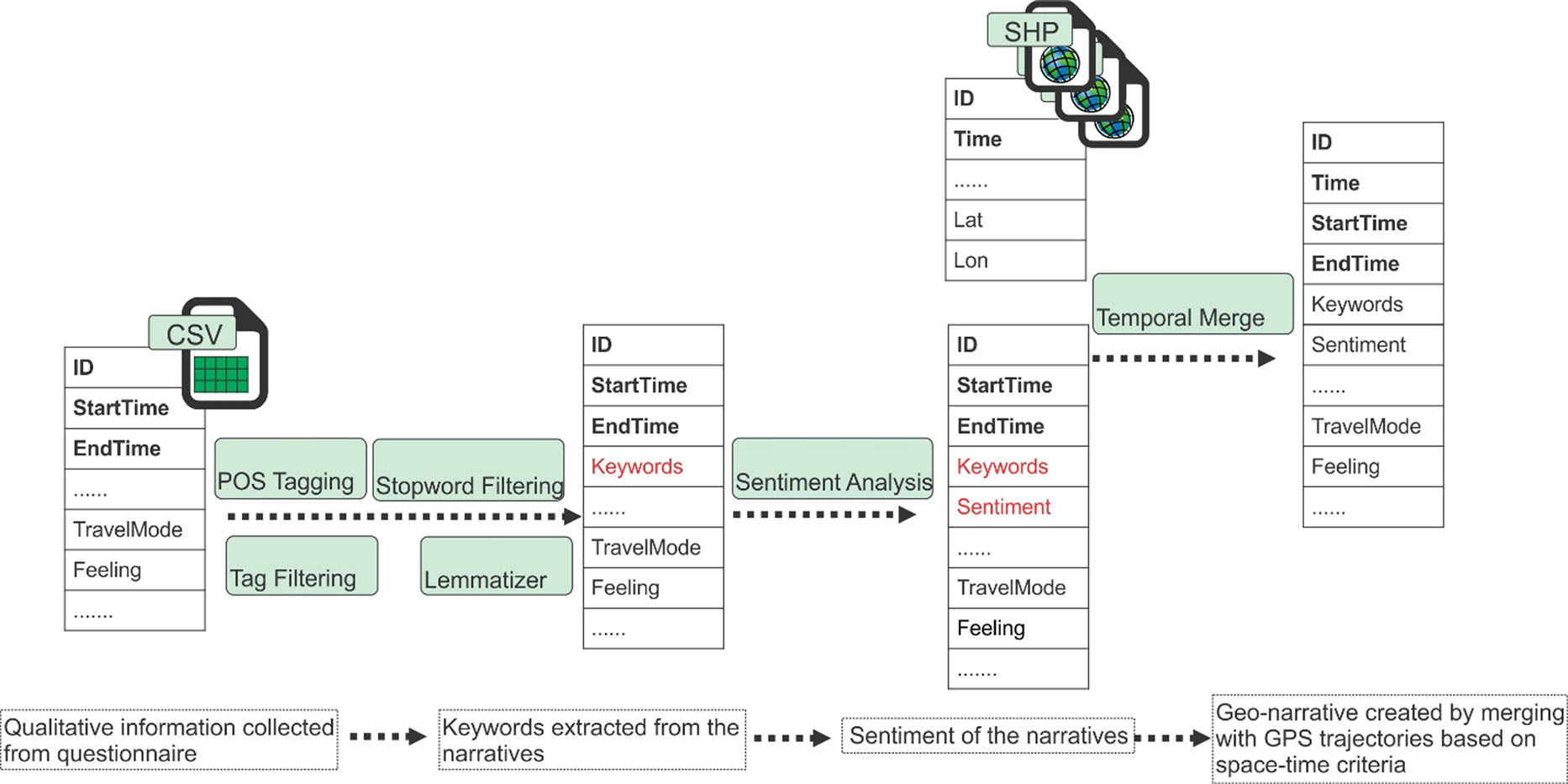
We started by collecting two types of data: GPS trajectories (where people went) and narratives (what they felt and experienced at different locations). Think of it as pairing a travel diary with a map. Using a web-based platform, we linked these datasets together, creating a seamless way to visualize not just the routes people took, but also their emotional responses to specific places.
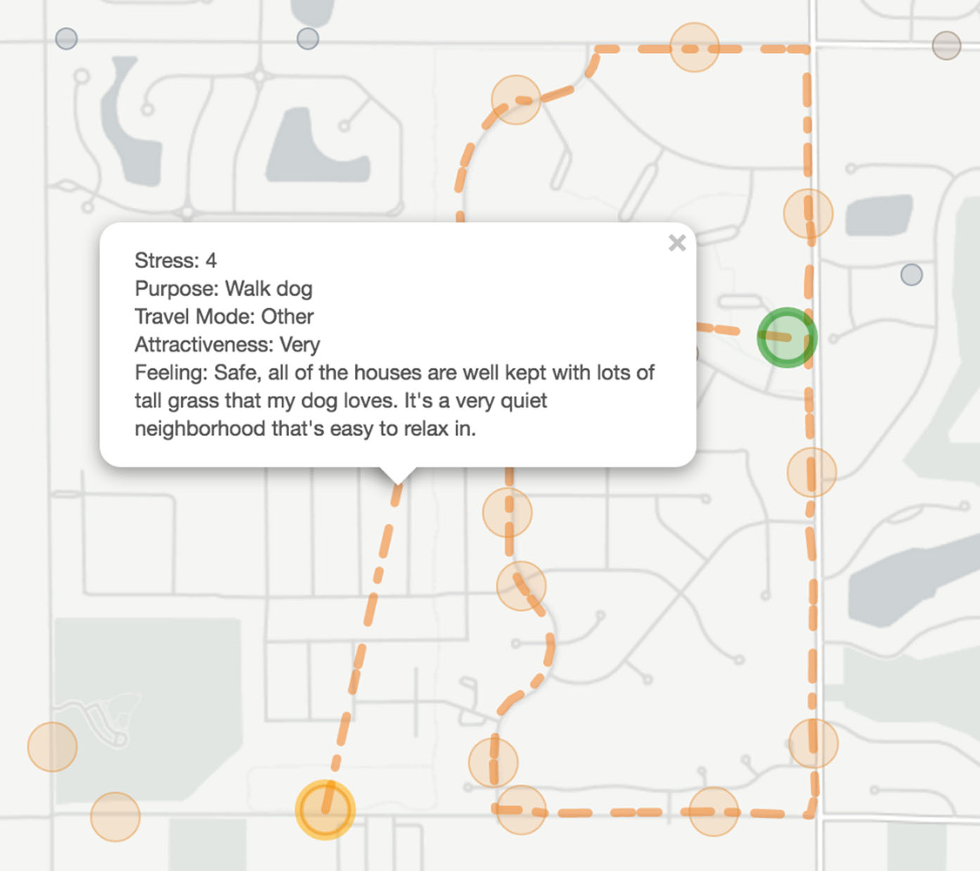
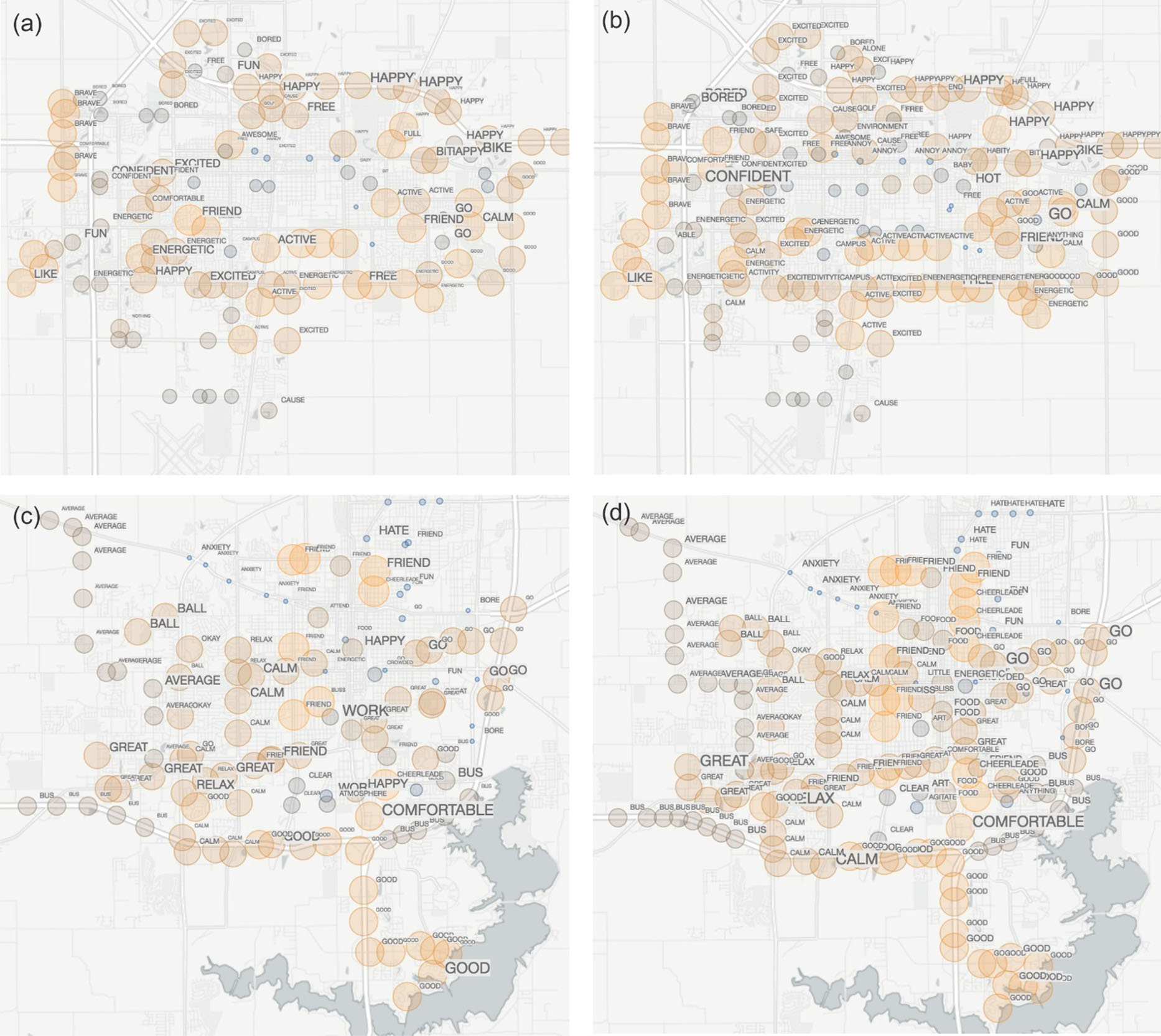
Here’s how it works: Imagine you’re walking through a park. Your GPS records your path, and at the same time, you jot down how you feel—maybe you love the smell of the flowers or find a particular bench uncomfortable. Our tool takes these notes and turns them into a georeferenced word cloud, where the most frequently mentioned words (like “peaceful” or “crowded”) are displayed on the map. The size of the words reflects how often they were mentioned, giving a quick visual sense of what people are feeling in different areas.
📊 What We Found: Emotions on the Map
When we tested our tool with data from 155 adolescents in Illinois, the results were fascinating. We could see not only where they traveled but also how they felt about different places. For example, one participant’s route showed that she felt stressed near a busy intersection but relaxed in a quiet park. By aggregating these individual experiences, we created maps that revealed broader patterns—like which neighborhoods were consistently described as “calm” or “noisy.”
One of the coolest features of our tool is its interactivity. You can zoom in to see detailed word clouds for specific streets or zoom out to get a city-wide view of emotional hotspots. This flexibility makes it a powerful tool for urban planners, public health researchers, and even community groups looking to understand how people interact with their environment.
💡 What This Means for the Future
Our tool isn’t just a neat way to visualize data—it has real-world applications. For example, city planners could use it to identify areas that need improvement based on how people feel about them. Public health researchers could study how environmental factors like noise or green spaces affect mental health. And communities could use it to advocate for changes that reflect their lived experiences.
Looking ahead, we’re excited to expand this tool to include more types of data, like photos or audio recordings, and to make it even more user-friendly. Imagine being able to upload your own travel data and instantly see a map of your emotional journey—it’s like turning your daily commute into a story waiting to be told.
So next time you’re out and about, take a moment to think about how your surroundings make you feel. Because, as our research shows, every step you take tells a story—and now, we have the tools to map it.